Develop interfaces and journeys to enhance customer autonomy with self-service financial tools, improve access to data, and reduce support costs.
Performance in the project
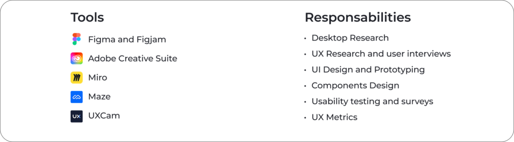
My role: Sr. UX Designer
About project assignment
The Finance section accounts for 51.1% of all accesses within the app, highlighting the scale and importance of this initiative. Being entrusted with a feature of such relevance reflects the stakeholders’ confidence in my ability to deliver a high-impact solution. It also reinforces the need to design a seamless, objective, and efficient experience—something that users consistently seek and stakeholders deeply value.
Design Process
01
Understanding the scenario
Problem
Users need to access the Finance section and their account statements through the app, but the legacy model is limited and lacks essential information. This leads to frustration, increases calls to customer support, raises operational costs, and negatively impacts the user experience.
Challenge
We aimed to provide greater autonomy to customers through self-service features for statements and financial information, allowing them to quickly access their transactions and relevant data. This approach helped reduce the company’s costs related to support and phone calls.
Goals
To develop an efficient solution, using market best practices, so customers can quickly find what they need in the financial section, improving their experience in the most accessed area of the app. The enhancement aims to streamline access to financial information and make navigation intuitive.
User personas
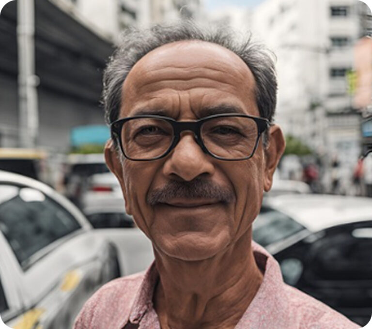
Persona 1 – Carlos Camargo Arruda 📌 Profile: Age: 52 years Profession: Rideshare driver Location: São Paulo – SP Level of familiarity with technology: Low Devices used: Entry-level Android smartphone Accessibility: Uses reading glasses and prefers large text
📌 Behavior and Pain Points: Uses apps daily for work (rides, maps, and payments), but struggles with new interfaces. Gets frustrated when he can’t quickly find the information he needs. Fears making mistakes while navigating and accidentally incurring charges or accessing something inappropriate. Prefers straightforward solutions with clear buttons and simple language.
📌 Needs and Expectations: ✔ Clean and intuitive interface, with no excess information. ✔ Accessibility options, such as font size increase and voice commands. ✔ Simple tutorial or quick help to understand features. ✔ Direct access to the statement without needing to click through multiple screens.
Persona 2 – Bianca Andrade
📌 Profile:
Age: 27 years
Profession: Marketing Analyst
Location: Recife – PE
Level of familiarity with technology: High
Devices used: iPhone and laptop
Accessibility: No restrictions, but values speed and efficiency
📌 Behavior and Pain Points:
Uses multiple apps for work and leisure, but dislikes cluttered interfaces.
Gets impatient with slow processes or lack of integration between apps.
Finds it frustrating when an app doesn’t allow customization or shortcuts to frequently used features.
Prefers well-organized dashboards and straightforward information.
📌 Needs and Expectations:
✔ Quick access to statements, preferably with a shortcut on the home screen.
✔ Integration with notifications to alert about recent transactions.
✔ Option to download statements in different formats (PDF, CSV).
✔ Modern, responsive design with easy access to information and no unnecessary steps.
02
Benchmarking
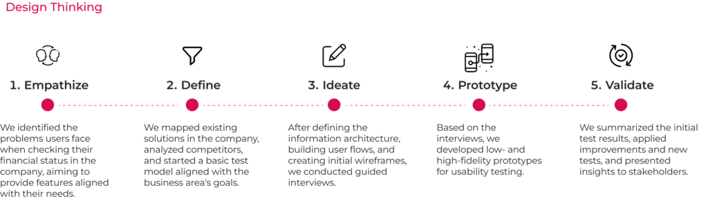
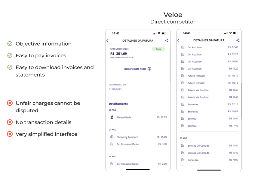
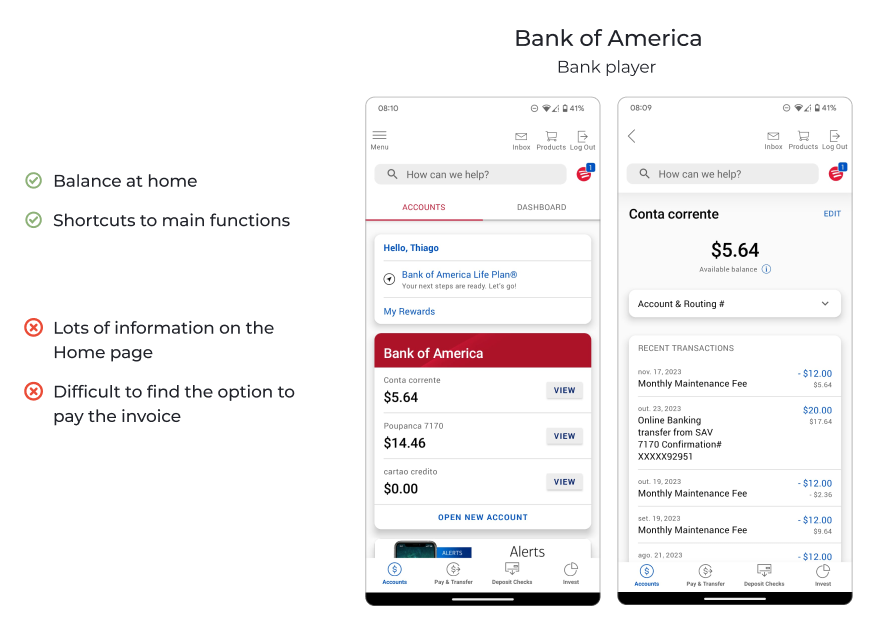
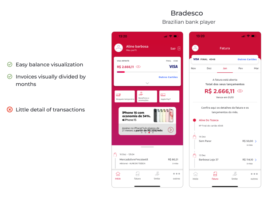
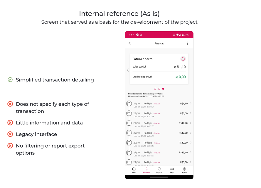
I used direct competitors and other market players as references, analyzing visual elements and user journeys to define benchmarks and draw inspiration for best practices in the project.
03
Information Architecture
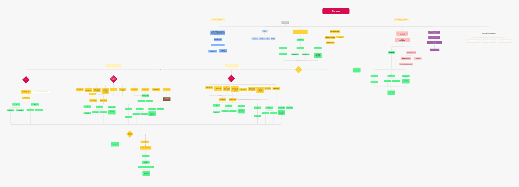
Alongside the competitor analysis, I created a detailed information architecture and system-level diagrams to map user flows, dependencies, and key journey touchpoints. This step was essential to provide a clear and structured view of the solution, guiding design and integration decisions throughout the project.
Due to the complexity and length of the flow, it’s not feasible to display all the details here in the case study. However, this structure was essential in shaping the refined journey presented in the following sections.
04
Wireframes
For the initial internal and client validations, we developed interface models to assess the project’s progress. Early drafts evolved throughout the process, with screens being refined over time. As new needs emerged, we also proposed additional components to the Design System to ensure consistency and scalability.
05
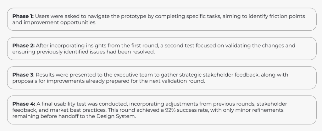
Usability Tests
Several rounds of usability testing—both quantitative and qualitative—were conducted between the wireframe and high-fidelity prototype stages. Since the main goal of this case study is to highlight the process without overwhelming it with excessive details, I’ve chosen to present only a selection of key results. The intention is to show that the product development was primarily guided by real user insights and needs.
06
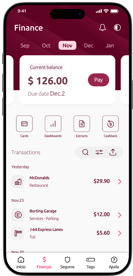
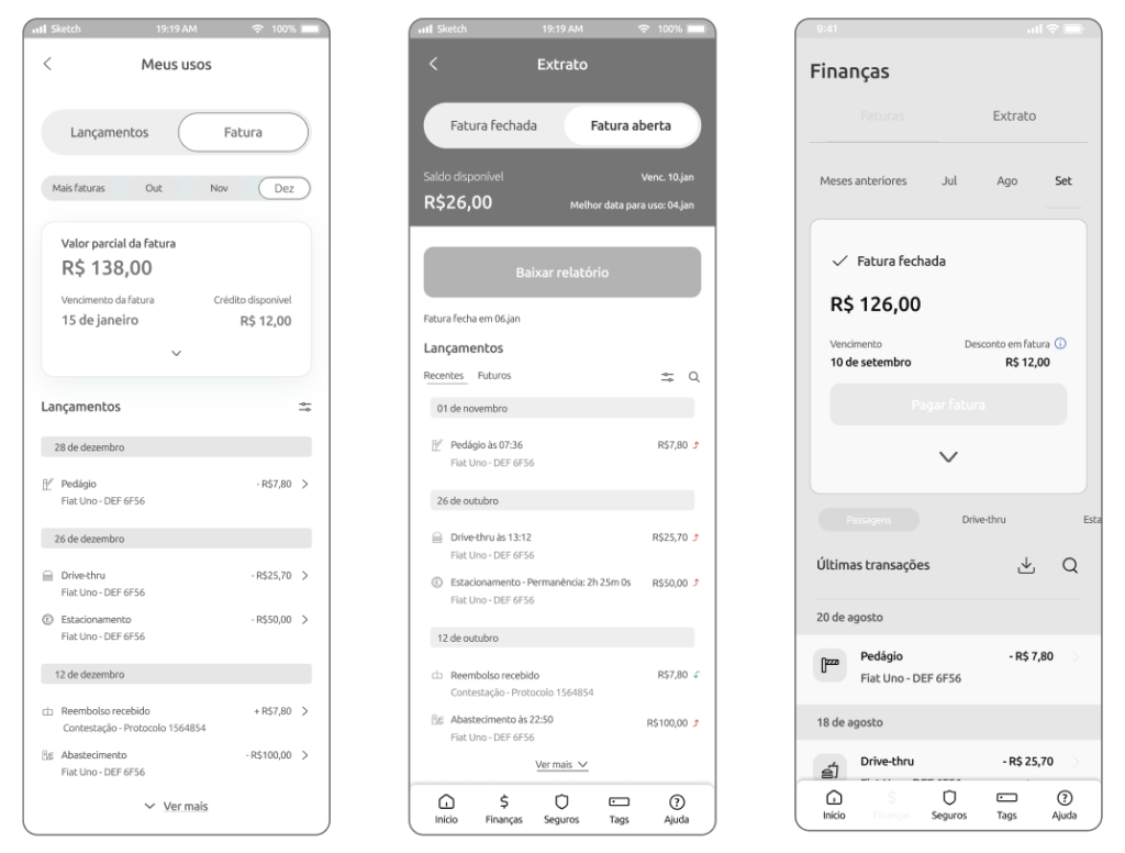
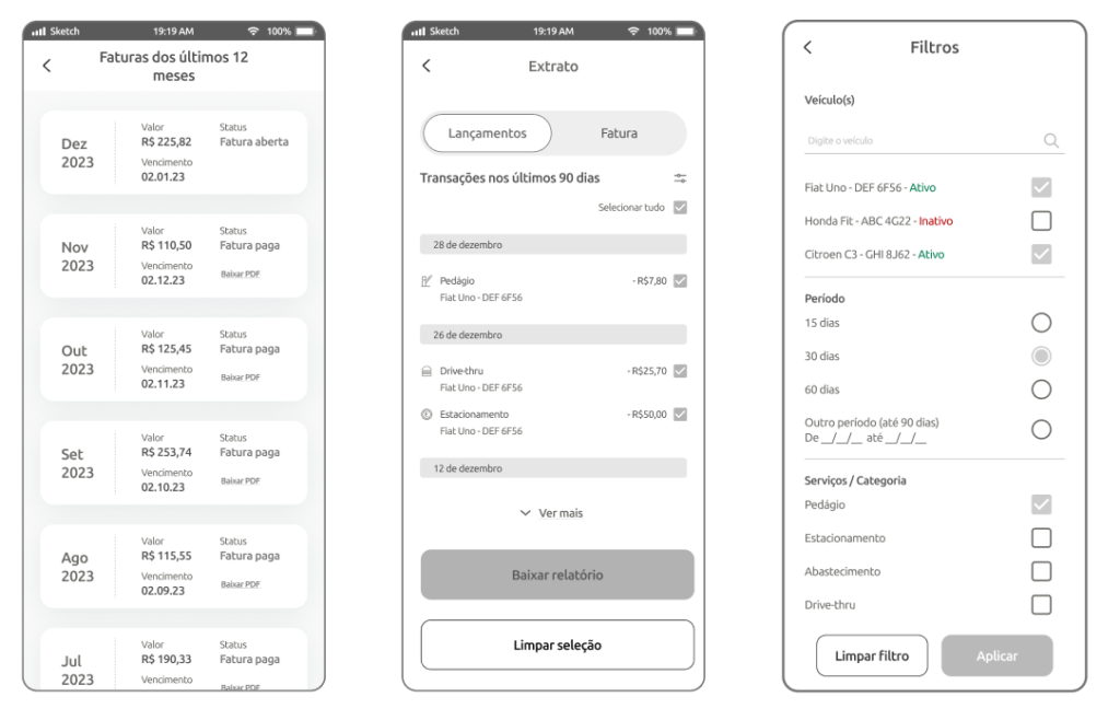
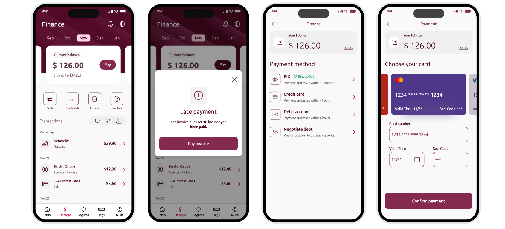
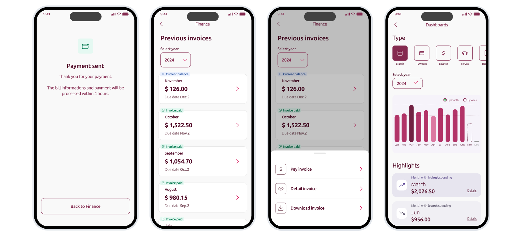
High-Fidelity Screens
Final Delivery & Approval
High-fidelity screens developed based on validated user insights
Approved by executives, stakeholders, and end users
Interface aligned with both business objectives and user expectations
Ready for integration with the Design System and development phase
07
Conclusion
This project is part of a broader, continuously evolving product ecosystem. What you’ve seen here is just one segment of a much more extensive user experience—highlighting a specific journey that allowed me to demonstrate my approach, methodology, and problem-solving skills within the UX Design process. While the product includes additional flows and variations, this case study was intentionally scoped to provide a clear and focused view of the value delivered through thoughtful design.